ANNWN Distillery needed to establish credibility and distinction in a crowded spirits market without relying on heritage clichés or invented legacy.
A contemporary brand system rooted in folklore rather than nostalgia, using restraint and typographic clarity to create intrigue without over-explanation.
The process began with research into folklore, language, and contemporary spirits branding to understand where ANNWN could sit authentically.
From there, visual exploration focused on contrast:
- order versus disruption
- clarity versus mystery
- modernity versus myth
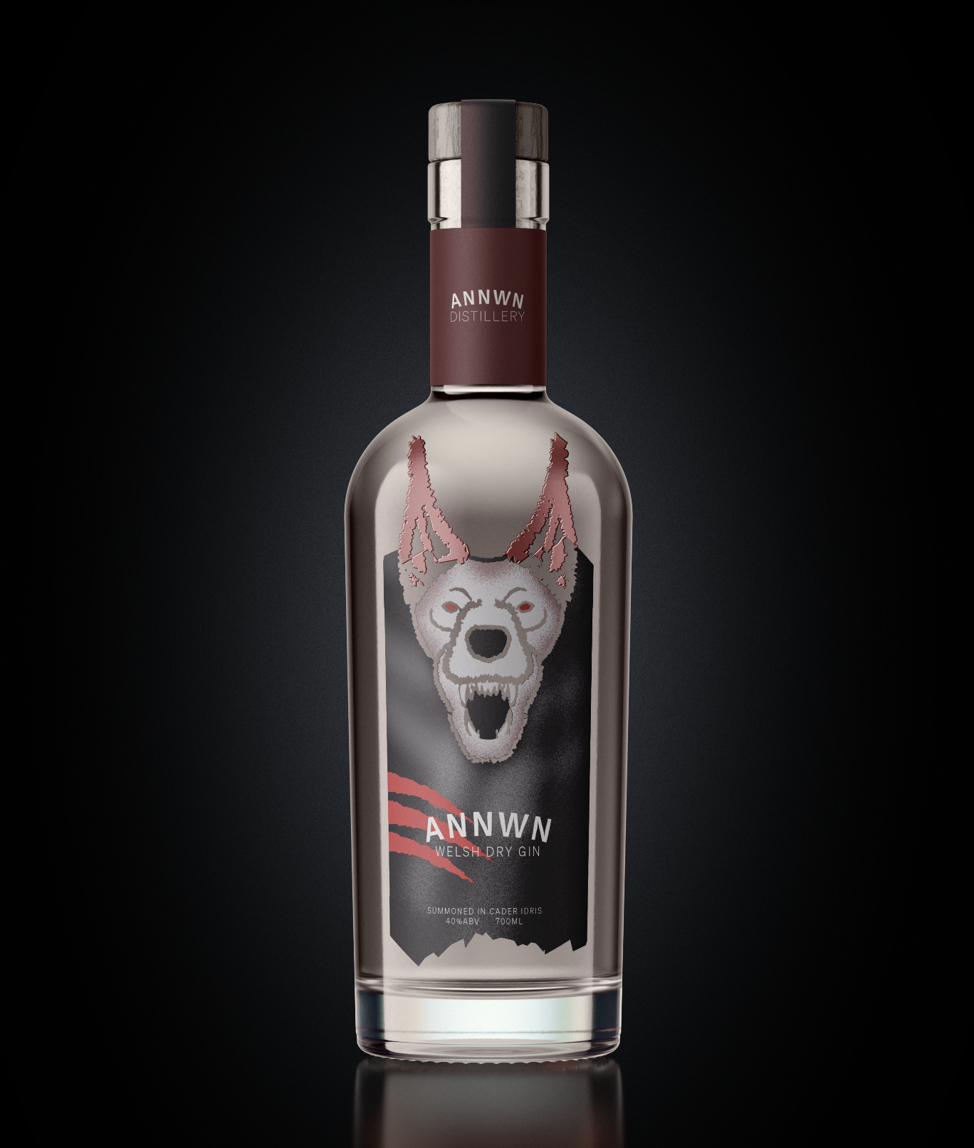
Typography was treated as the primary storytelling device, supported by a restrained colour palette and material-led packaging considerations.
Concepts were refined through iteration, stripping back excess until only the essential elements remained.
Every decision was pressure-tested against one question:
Does this add meaning, or just noise?
One of the key challenges was resisting the urge to over-communicate the brand story. With mythology as a foundation, there was a constant risk of leaning too heavily into symbolism and losing clarity.
The solution was to imply rather than explain, allowing the audience to engage with the brand at their own depth.
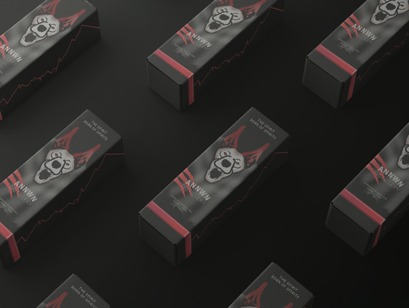
Another challenge was ensuring the packaging system remained scalable across future product lines, without locking the brand into a single visual moment.
The final outcome is a branding and packaging system that is confident, modern, and quietly distinctive.
ANNWN Distillery now has a visual identity that stands apart from traditional craft spirits, while still feeling rooted and intentional. The system is flexible enough to grow with the brand, yet restrained enough to remain recognisable across touchpoints. Rather than relying on trends or theatrics, the brand invites engagement through clarity, atmosphere, and considered design.